Building an Astro Portfolio with AI-Assisted Development
MODERN PORTFOLIO FEATURING AI-ASSISTED DEVELOPMENT AND SMOOTH VIEW TRANSITIONS.
Building an Astro Portfolio with AI-Assisted Development
Impact Statement
A case study in modern web development: leveraging Figma Make prototypes, AI coding agents, and Astro view transitions to build a performant portfolio site.
Overview
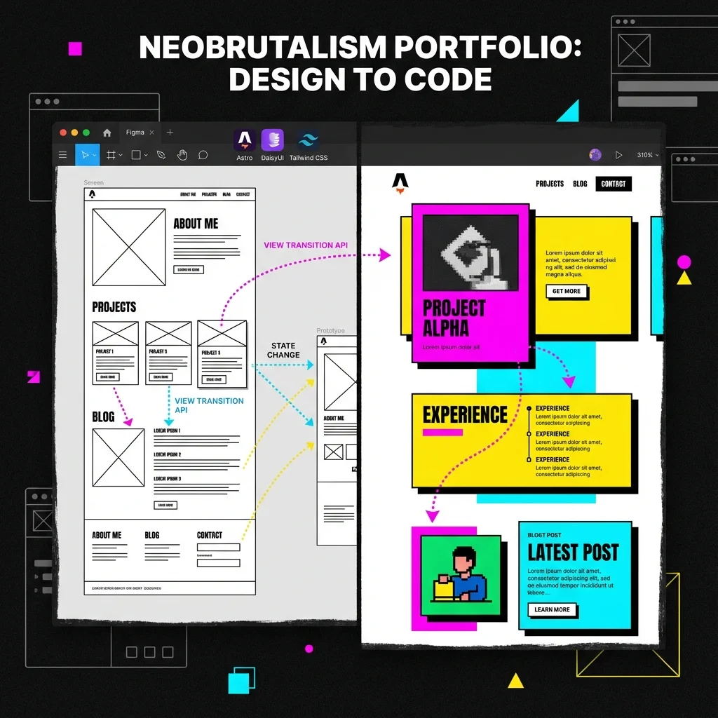
This personal portfolio site is itself a case study in modern web development practices. Rather than a traditional build process, it leveraged Figma Make for rapid prototyping, AI coding agents for conversion and implementation, and Astro’s view transitions for a polished SPA-like experience.
What Makes This Site Different
AI-Assisted Design Evolution
This site’s design workflow has evolved through multiple AI design tools:
Initial Approach (Figma Make): The site started as a prototype generated with Figma Make, which exported a React codebase. AI coding agents converted this to Astro components.
Current Approach (Google Stitch): Design iteration now uses Google Stitch, which generates framework-agnostic HTML/CSS. This eliminates the React-to-Astro conversion step and enables faster iteration on visual designs.
For a detailed comparison of AI design tools, see AI-Assisted Design: From Prompt to Production.
Astro View Transitions
The site uses Astro’s ClientRouter for smooth, app-like navigation without JavaScript frameworks. Astro provides transition directives like transition:name, transition:animate, and transition:persist to control how elements behave during navigation.
Navbar Persistence: The navigation bar uses transition:name="main-navbar" to remain stable during page transitions, with individual nav links animated via transition:name for active state morphing.
Work Card Animations: Project cards on /work use coordinated transitions:
transition:name="work-card-{slug}"- Card container morphs to detail pagetransition:name="work-img-{slug}"- Hero image expands seamlesslytransition:name="work-title-{slug}"- Title text transitions in placetransition:name="work-body-{slug}"- Content area animates smoothly
This creates a shared-element expansion effect where clicking a project card feels like zooming into the detail page.
URL-Based Category Filtering: Rather than client-side JavaScript filtering, categories use static routes:
/work- All projects/work/category/web-platforms- Filtered by category/work/resume-chatbot- Project detail
This approach provides:
- SEO-friendly URLs - Each category is a crawlable page
- Shareable links - Users can share filtered views
- No JavaScript required - Works with JS disabled
- Proper view transitions - Cards animate seamlessly between all/filtered/detail views
Technical Stack
| Layer | Technology |
|---|---|
| Framework | Astro 5 with Content Collections |
| UI Components | DaisyUI 5 (neobrutalism theme) |
| Styling | Tailwind CSS 4 with CSS-first config |
| Transitions | Astro ClientRouter + View Transitions API |
| Content | MDX with Astro Content Collections |
| Deployment | Cloudflare Pages |
Neobrutalism Design System
The site implements a custom neobrutalism theme through DaisyUI overrides:
- Bold borders - 2-4px solid black borders on all interactive elements
- Hard shadows - Offset box shadows (4px 4px) for depth without blur
- Vibrant colors - High-saturation accent colors (magenta, yellow, cyan)
- Uppercase typography - Headlines use uppercase with tight tracking
- Chunky components - Cards, badges, and buttons with generous padding
View Transitions Deep Dive
Navigation Active State Morphing
The navbar implements a morphing active indicator that smoothly moves between nav items during page transitions. Here’s the actual implementation:
Navbar Component Structure:
<nav class="btn-group h-full items-center relative"> {topLevelNavItems.map((item) => ( <a href={item.href} class={topLevelLinkClass(item.href)} transition:name={`nav-link-${item.href.slice(1)}`} > {isActive(item.href) && ( <span class="nav-active-bg" transition:name="nav-active-bg" /> )} <span class="relative z-10">{item.label}</span> </a> ))}</nav>Key Concepts:
-
Per-link transition names: Each link gets
transition:name={nav-link-work},transition:name={nav-link-approach}, etc. This allows Astro to track each link’s position across pages. -
Shared active background: The
nav-active-bgspan only renders on the active link, but uses a sharedtransition:name="nav-active-bg". When navigating from/workto/background, the background element “moves” from one link to another. -
Z-index layering: The text uses
relative z-10to sit above the morphing background.
CSS Animations for View Transitions:
/* BaseLayout.astro <style> block */@keyframes scale-up {  from { transform: scale(0.8); opacity: 0; }  to { transform: scale(1); opacity: 1; }}
@keyframes scale-down {  from { transform: scale(1); opacity: 1; }  to { transform: scale(0.8); opacity: 0; }}
Project Card Expansion
When navigating from /work to /work/[slug]:
- The card’s hero image matches the detail page hero via shared
transition:name - The title and body content animate from card positions to full-width layout
- Browser calculates geometry changes and animates position/size automatically
Lifecycle Hooks
The site uses Astro’s view transition lifecycle events for state management:
ClientRouter Setup (BaseLayout.astro):
<head> <!-- Enable SPA-style navigation --> <ClientRouter /></head>Dark Mode Sync:
document.addEventListener("astro:before-swap", (event) => { event.newDocument.documentElement.dataset.theme = localStorage.getItem("color-scheme") || "light";});Re-initializing Scripts After Navigation:
With view transitions, DOMContentLoaded only fires on the initial page load. For interactive elements (like category filters), use astro:page-load:
function initCategoryFilter() {  const buttons = document.querySelectorAll('[data-category]');  // ... filter logic}
// Initial loadinitCategoryFilter();
// After view transitionsdocument.addEventListener('astro:page-load', initCategoryFilter);
This pattern ensures interactive scripts work both on initial load and after SPA-style navigation.
AI-Assisted Development
This site was primarily built using AI coding agents (Cursor, Claude, Antigravity) with specific patterns:
- Component extraction - Agents extracted reusable patterns from Figma export
- Content separation - All content moved to
src/content/collections - AGENTS.md guidance - Project-specific instructions for AI collaborators
- Iterative refinement - Rapid feedback loops between human and AI
Lessons Learned
- Figma Make as reference - Export quality varies, but it’s excellent as a translation reference
- View transitions require planning - Element naming must be consistent across pages
- Neobrutalism is opinionated - Hard shadows and bold borders need careful balance
- AI agents need structure - AGENTS.md and clear file organization accelerate development
Deep Dives
For more technical detail on specific components:
- AI-Assisted Design: From Prompt to Production - Comparing Stitch, v0, and Figma AI for design workflows
- Consistent Layouts Make MPAs Feel Like SPAs - Shared element transitions and the “stable anchor” pattern
- Persistent Filter Bar with View Transitions - Scroll position restoration, hover state persistence, and the
transition:persistpattern - Navbar Active State Morphing - Sliding active indicator, animation direction control, and entry/exit animations